Retail Display Signage: Your Store’s Silent Communicator
Retail signage works 24/7 telling your customers about your store, where to find things, what a product is, what it can do for them, and their cost or savings when they buy.
Telling a Complete Story
There are thousands of articles about why, where and how to use signage. For simplicity, we can distinguish retail signage by type:
- Ambiance
- Departmental
- Aisle Category
- Shelf Level
Ambiance sign graphics play a huge part in communicating a feeling or life-style, often sub-consciously because you do not really read them. These are large signs strategically placed on walls and/or hung from ceilings. Select these signs carefully to make sure they reflect the feeling or story you wish to tell.
Smaller versions are also used within department endcaps to emphasize a brand or a specific product category.
Departmental signs identify a group of merchandise, leading to major areas within the store. These are signs large enough to see over displays and shelving. The signs can be one or two word text or combined with a matching graphic.
A word about fonts; your sign font should be consistent throughout your store, advertising, and marketing. Font size should be read easily from a distance.
The fancier the font, the more difficult it may be to read.
For example, which sign is easier to read?
Both are the same size font.
 Aisle category signs tell shoppers what type of items are within a given aisle. Like road signs, aisle signs tell them what to expect up ahead. Even if your customer does not go down the aisle, it still communicates what is located there. Properly designed they are really effective.
Shoppers are able to quickly find what they want, actually seeing more products in less time. And they will be purchasing along the way. They will love it and, so will your sales!
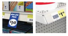
Shelf level signage is vital in conveying product information, benefits, and value.
This is the point of the buying decision. Provide information that makes the evaluation process easy. Follow the rules of good signage: be specific, keep it simple, make it a headline, and have a call to action. Also, do not encumber your customer with a  conversion task.
For example, if a product is measured in ounces, provide the regular price and the sale price in ounces. This can be challenging if customers compare like products of differing brands.
A manufacturer may measure in pounds, another in ounces, or one in liters, the other quarts, or pounds and kilograms. You get the idea. Where possible, equalize the measurements for shoppers making comparisons easy.
Housekeeping
Clean organized signage promotes store image and will maximize your sales. Dirty, broken, or signage torn from abuse, take away sales. Your store image will also suffer if signs are poorly written or inaccurate.
Outdated Sale signs, left with items no longer on sale, cost you dollars too. Avoid challenges at the checkout register. If you are, handle them professionally; honor the price the customer saw, and thank them for pointing out that a correction is needed. Then quickly get it changed. Sign maintenance keeps signage looking good and prices where they should be.
For more information about signage options, contact Midwest Retail Services today. Call 800-576-7577, use our convenient site link, or email us at info@mw-rs.com. One of our signage experts will be available to help you!
[msh_feedburner]


